Methods to detect, characterize, and remove motion artifact in resting state fMRI
Jonathan Power, Anish Mitra, Tim Laumann, Avi Snyder, Brad Schlaggar, Steve Petersen
Neuroimage 2014 Jan 1; 84:320-41
PubMed link
Figures (ppt)
Files (csh, Matlab scripts)
This is a long, dense paper. In one version, I actually suggested that readers absorb it over 3 sittings. I ended up taking that suggestion out, but really, I do recommend that. I tried breaking the paper into 2 or 3 smaller papers, but they remained so interdependent that I eventually gave up on the multi-paper version. And the version you read now was preceded by an entirely different paper of similar length with different analyses that I ended up never submitting. It probably took me two years, off and on, to write this paper to my satisfaction. In the end I think it was worth it. We gained a lot of understanding about motion artifact, and the data more generally, in writing this report.
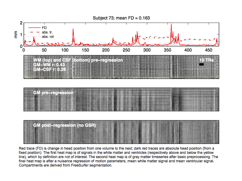
I think one of the main advances of this paper was one of the simplest: just visualizing the entire gray matter timeseries as a heat map along with traces indexing artifact like motion. In this paper I only did it with motion traces but now that I'm at the NIH I also add physiological traces like RVT measures. A single example from the paper is below (it's from the Supplemental Cohort Illustration), where the red trace is Framewise Displacement, indexing how much the head moved from volume to volume. The darker red traces are the absolute position of the head from a reference origin position. In the first heat map nuisance voxel timeseries from the white matter (above the yellow line) and ventricles (below the yellow line) are shown, and you can see that signal changes co-occur with motion are prominent. Below that are gray matter voxel timeseries before and after a nuisance regression. This type of plot instantly tells you how motion is affecting the data in terms of the magnitude and prevalence of signal changes. It also conveys instantly how poorly some of our nuisance regressions do at removing artifactual variance. The bottom plot is cleaned up some relative to the middle plot, but it's also evident that you want a lot more variance out of the data than was taken out.
In the paper, I said that it was very helpful to examine dozens these plots from individual subjects to build up a mental picture of the variety and severity and prevalence of motion artifact in a dataset. I put a Supplemental Cohort Illustration up for that paper, illustrating such plots for 160 subjects. Below, you can find the first 44 subjects I've analyzed at the NIH. Data are courtesy of Peter Bandettini and Prantik Kundu, and were preprocessed by Mark Plitt. These are multi-echo data at the "optimally combined" stage of processing, which is where the multiple echoes are combined into a single image after some preprocessing. You can think of this as minimally processed data, ready for denoising. And keep in mind that the data were acquired at the NIH and processed in AFNI, so it's all independent of what I did for the 2014 paper. The plots are analogous to the one above, in terms of scaling, and the subjects are ordered from most to least motion.
These plots look much like the plots from the WashU data. They indicate (1) that a lot of the variance in gray matter is artifact since you often see corresponding changes in the white matter and ventricular signals, (2) that much artifact co-occurs with motion, and (3) much artifact doesn't have associated motion. It's also easy to see that much artifact is global in nature. Even though artifacts are evident in these plots, they're actually not so evident if you're looking at slices over time as a movie, or if you view a trace of the global signal or a few signals. But seeing hundreds or thousands of signals at once is very effective in communicating the behavior of the data.
Another way to use these plots is for seeing what is and is not removed by a denoising technique. I showed one figure in the paper with such plots stacked vertically, but the plots are most effective for assessing denoising when you can go from one plot to the next as a slide show or movie. I'm putting a few subjects from the above gallery below, showing the timeseries after various nuisance regressions. The regressions are either [24MOT WM CSF] or [24MOT WM CSF GS], corresponding to the main regressions of the 2014 motion paper.
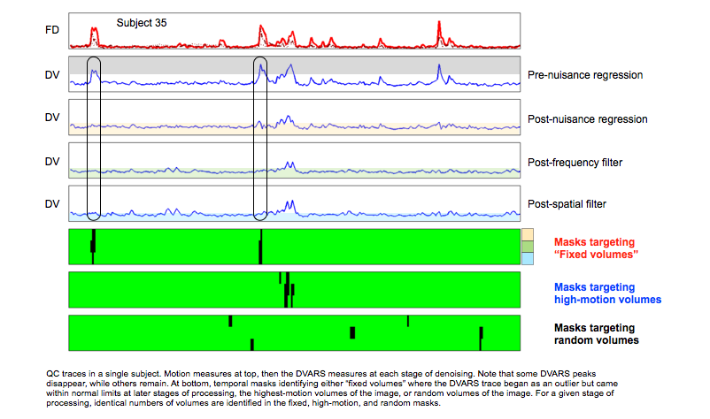
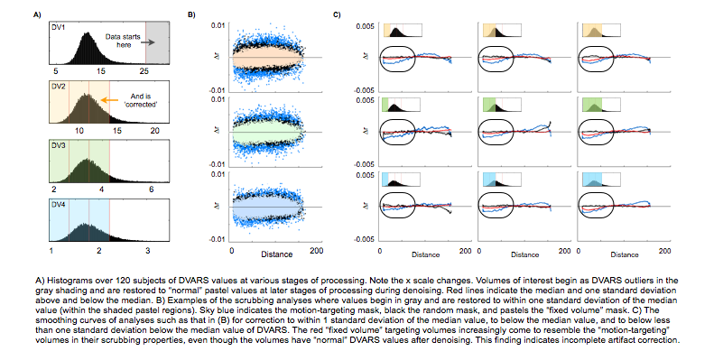
I think that's enough on this topic. The paper raises many issues and I'm not going to revisit all of them, but one valuable analysis was buried in the supplemental materials, and I think it was easily overlooked amidst all the other analyses and I'd like to unearth it and present it a little more fully since it is relevant to how some groups try to assess motion artifact. If you look at a trace of DVARS, or some comparable QC measure, as you go through denoising stages you'll see the trace shrink. This occurs both in the magnitude (scale) of the trace, and in particular parts of the trace, where outliers at earlier stages get corrected by denoising and come to resemble other timepoints in the QC trace. An example is below (here I scaled the axes with the trace so you don't notice the shrinking magnitudes and instead focus on the waveforms; the histograms below show the scaling differences).
The question I'd like to address is whether when a peak in DVARS disappears over denoising, we should now regard that data as "fixed". So those times that have black ovals are the times of interest. One way to answer this question is to use scrubbing (censoring) analyses to ask whether removing the "fixed" volumes has effects like removing random other parts of the data, or whether the effects are more like removing unfixed, high-motion parts of the data. So that's what the temporal masks at the bottom of the figure do, for each stage of processing. When we look at the effect of censoring such types of volumes over all subjects, we obtain plots like those below.
Notice how the red smoothing curves (in (C)) look more and more like the blue smoothing curves the more lenient we are in calling the data "fixed" (though always we are well within "normal" DVARS values). This finding indicates that the data can look better (according to DVARS) but still be abnormal at later stages of processing. If this conclusion is correct, it undermines the use of DVARS traces to establish improvement in data quality (like measuring correlations between FD and DVARS over processing stages).
There are other issues raised by this paper that could generate further interesting discussion, but this is probably enough on this paper. Some of those other issues are discussed in some of my more recent reviews. As always, you can email with questions/comments.
JDP 2/3/15


